Fund Discovery UX UI
A web application where social entrepreneurs can find the funding opportunities best suited for themselves. Through an automated process designed within the app, social entrepreneurs are recommended the best option for each funding type on one centralized page.
YEAR
Fall 2020
TEAM
David Cao, Terence Liu, Jasmine Wang, Reiza Gabriel
Click the button below for the final interactive mock-up on Figma! 🡫

Project Summary.
PROJECT TASK
To partner with a start-up company to define areas of improvement on the user experience of their pre-launching web application. Methods include developing user personas and communicating with the client and potential users.
MY ROLE
Analyzed the needs of the potential users of the web application by researching, interviewing, and brainstorming. Designed the layout of a new interface and pitched the design concept to a real client while cooperating with other team members.
Research.
FINDING A CLIENT
We began our project by connecting with a start-up company that is looking for usability research to be conducted with their pre-launching web application.
Impactraction, an Ontario-based startup company that helps social entrepreneurs find potential funding from governments and investors, was selected to be our client.


Presentation slides designed by me introducing Impactraction and their stakeholders.
METHOD OF RESEARCH
My team got together to conduct research and data collection on the marketplace and similar products currently available for users.
Discussions
‣ Regular meetings with Ashraful to discuss Impactraction’s mission, goals, and frustrations
Interviews
‣ Three one-on-one interviews with social entrepreneurs
‣ Two one-on-one interviews with potential social investors
Exploration
‣ Other fundraising web applications such as GoFundMe, KickStarter, etc.
‣ Existing government and private investor grants and loans
AFFINITY DIAGRAM
An Affinity Diagram was used as a tool to understand the company’s needs, goals, and issues.
We narrowed down the stakeholders and looked into trust-building issues, the application process, possible pain points, as well as other factors that relate to the core user goal of the application as a tool for finding funding for social entrepreneurs.

An Affinity Diagram was put together on Figma, designed to imitate the use of paper post-it notes.
Each color represents a different class of ideas.
Initial Design Focus.
INITIAL DESIGN FOCUS
Our design focus targeted simplifying the application process for social enterprises applying for funding through Impactration.
A simplified process would allow applicants to spend less time and effort searching for investors that share similar values and believe in their cause.


The first poster was created after the first meeting with the CEO of Impactraction, Ashraful Hasan.
The second poster was created to present the Design Focus and Design Interventions after interviews with potential clients led by other team members. The design of the posters was led by me.
IDENTIFIED PROBLEMS
Repetitive Action
‣ Funding applications often ask similar questions, and share similar processes.
Lack of Trust
‣ Small social enterprises struggle to build reputation and trust with investors.
Common Language
‣ Complex terms hinder understanding between social entrepreneurs and investors.
Lack of Starting Point
‣ New social enterprises do not know where to start looking for funding.
Understanding the Users.
USER PERSONAS & USER JOURNEY MAPS
After the design focus was decided, we created two user personas and two user journey maps to understand the possible users in their needs and goals, and what they might expect from using Impactration's service.
Creating personas helped us empathize with different users’ goals and frustrations. These insights helped us identify problems and possible ways to address them.
Their existing habits and knowledge, such as the difference in their language and technological skills, are also factors to consider in our design opportunities.
By creating user journeys for our personas, we were able to see what their habits/behaviors might look like during the funding application process. As both personas have different knowledge and skills, their funding application process is differentiated.
The user journey map allowed us to empathize with the user’s experience during the application process, and to see what types of pain points may come up from their perspectives. As a result, we found multiple directions and design opportunities we could move towards.


User Persona detailing the potential users’ fears, goals, motivation, frustrations, skills, and abilities.
Their detailed biography helped us envision the potential users and their needs.


User Journey with potential user scenarios of the existing system.
DESIGN QUESTIONS
After reviewing the user personas and user journeys, my team and I proceeded to ask the following questions and came up with three answers for each question.
How would we create a more comfortable and flexible application process while reducing the amount of time?
Autofill short questions (ex: contact information)
Allow users to save their progress and continue working on it later on
Provide step-by-step tutorials, guides, and tips for completing applications
How might we improve the overall writing quality of the application to better align with the adjudicators’ decision?
Interactive cues with definitions of complex legal terms and financial vocabulary
An editor that detects spelling errors, grammar checks, and suggests writing improvements
Have social entrepreneurs upload short videos to pitch their social impact project to investors
How can we help social enterprises decide which applications to pursue on Impactraction?
A feature for comparing two or more funding opportunities side-by-side
An indicator showing how well a project matches a funding opportunity based on eligibility and profile
Notifications for new funding opportunities that match their project
Reframed Design Focus.
According to the analysis, we adjusted our design focus to
"increasing the likelihood of social enterprises getting approved for funding by simplifying, accelerating, and improving the quality of applications through Impactration."
VALUE PROPOSITIONS
The reframed design focus was set with these value propositions in mind.
‣ Reduces the amount of time that reviewers have to spend reading through the application if there is higher clarity.
‣ Increased the quality and approval rate of applications can improve Impactraction’s credibility to social investors and social entrepreneurs.
‣ Data about alignment can help Impactraction focus on targeting investors with a specific background that aligns with the social entrepreneur.
Three Design Concepts.
CONCEPT 1: SAVE AND LOAD ANSWERS AND DOCUMENTS
A function for social entrepreneurs to save and load answers to application questions and external documents (i.e. ID and legal documents) from previously submitted applications. This feature would help save time and reduce repetitive actions by allowing social entrepreneurs to automatically fill applications by loading saved answers and documents. The function would also support the saving of multiple versions of answers to a question so that the applicants would be able to extract a specific answer that best fits the investor’s interest, improving their chances of receiving funding by aligning with investors.
THREE DESIGN CONCEPTS
According to the reframed design focus, our team came up with three design concepts applicable for each of the three design questions.
How the design solution will be implemented was illustrated by breaking down its stages, doing and thinking/experiencing of the potential user, and the pain points they may experience.

CONCEPT 2: COMPARISON OF FUNDING OPPORTUNITIES
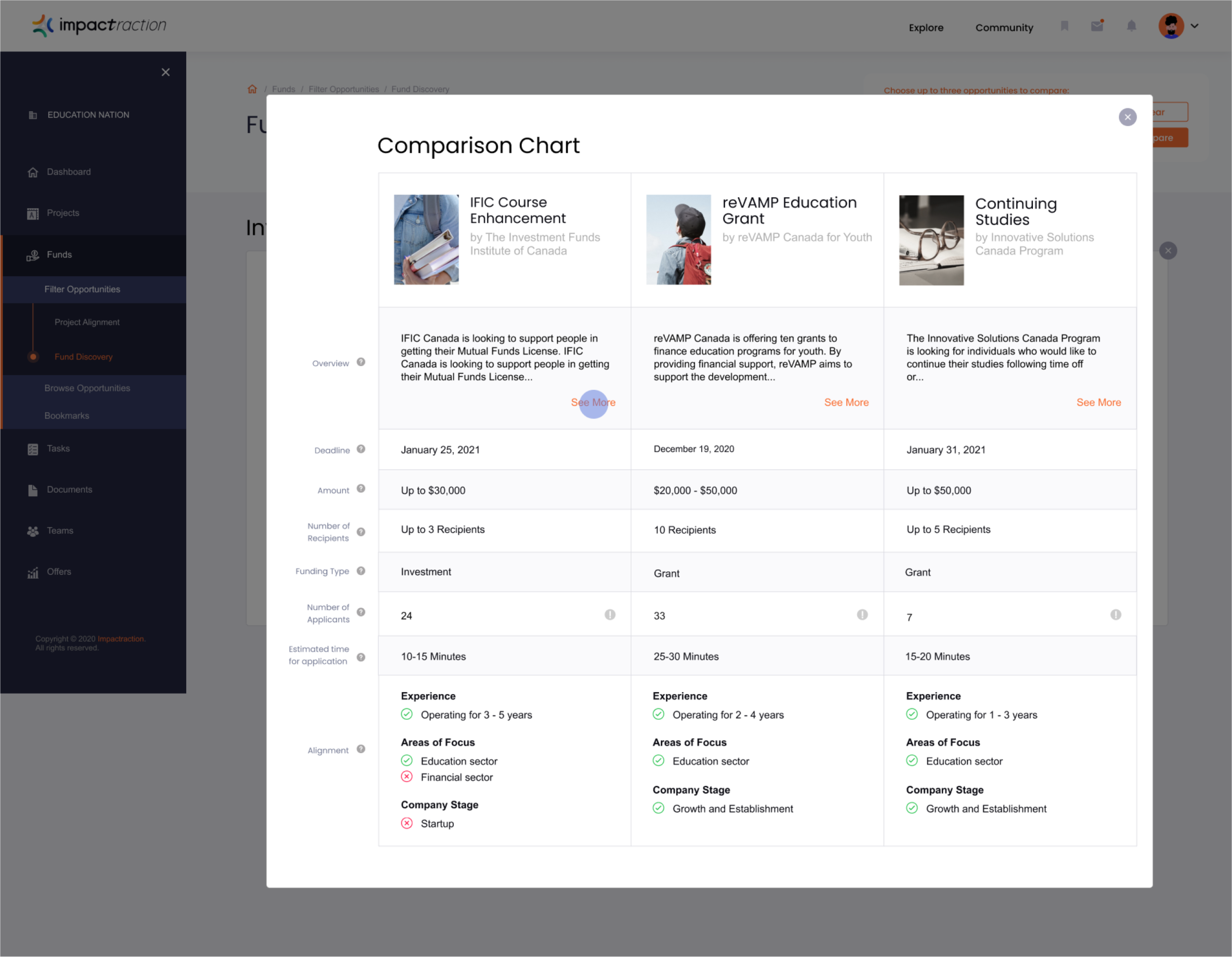
A comparison tool allows social entrepreneurs to compare multiple funding opportunities side-by-side. After being matched with several investors, applicants can select two or more funding opportunities to compare details about the types of investments and the amount available, as well as to find any common values. Making this information easier to visualize can help applicants decide which applications to pursue or prioritize on Impactraction.

CONCEPT 3: VIDEO RESPONSES
Applicants will now have the option to fill in a standard written or a video response application. The video responses works by uploading videos that answer required questions and include any additional comments. For entrepreneurs who are not confident in their written content, this is a method that can reduce grammatical and spelling errors, which can improve the quality and communication between applicants and investors. Video responses also offer another way to express one’s ideas and values more dynamically through voice, tone, and body language, which can establish credibility with investors.

Participatory Workshop.
PARTICIPATORY WORKSHOP
After coming up with these three design concepts, we felt that it was necessary to conduct a participatory workshop to better understand how effective these solutions will be in addressing real user needs. The participatory workshop was conducted online with the partnering company’s CEO and one potential client of the company present. The main purpose was to better understand how applicants would use our possible solutions for applying for loans and grants.
I took part in this workshop by creating slides that were to be used during the workshop, and by participating as a conductor while keeping time of the event and presenting the presentation slides. Team members, Terence and David, were in charge of leading the event as presenters.

FINDINGS and DISCOVERIES
We learned that for social entrepreneurs, a key issue is not knowing how to choose the best funding opportunities. Selecting the right opportunity increases the chances of approval and reduces the time spent searching and re-applying.

A poster designed by me and my teammates after the participatory workshop. Our insights of the participatory workshop is recorded at the bottom of the poster.
Final Concept.
After analyzing the results of the workshop, my team decided on one final concept to develop as an interactive Figma mockup.
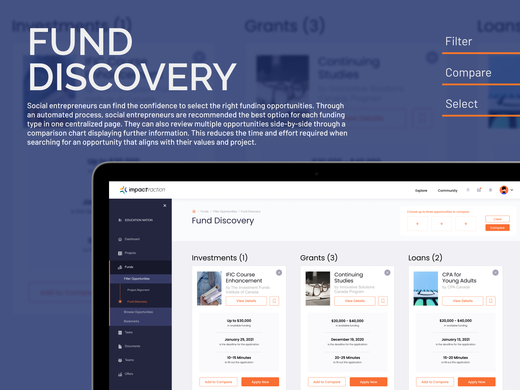
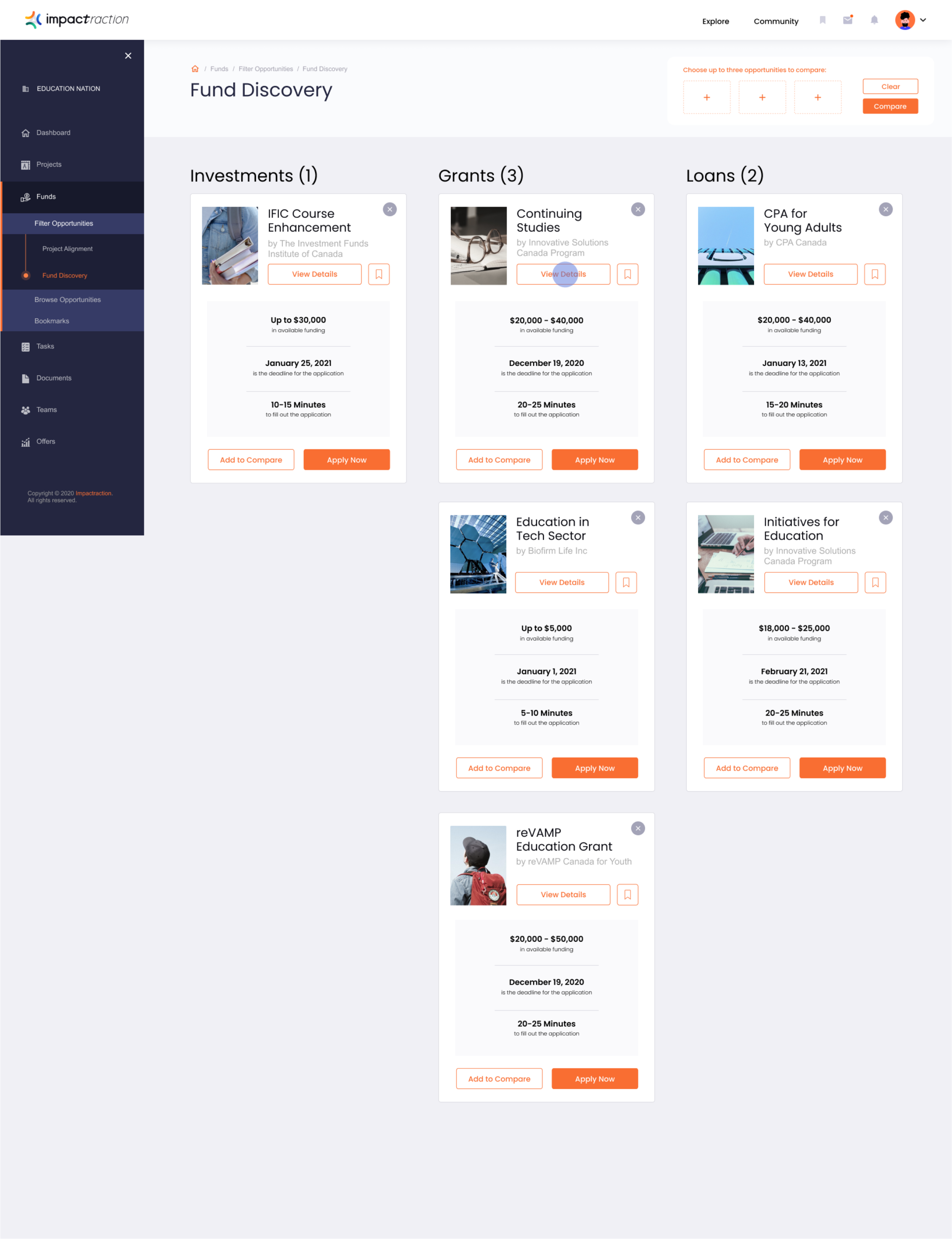
FUND DISCOVERY
Social entrepreneurs can find the confidence to select the right funding opportunities. Through an automated process, social entrepreneurs are recommended the best option for each funding type in one centralized page. They can also review multiple opportunities side-by-side through a comparison chart displaying further information. This reduces the time and effort required when searching for an opportunity that aligns with their values and project.

We created a poster card that details the function of the final concept “Fund Discovery” and a storyboard illustrating how the system would be interacted with by a potential user. The drawing of the storyboard was done by teammate David. I participated by writing the content and designing the poster.
Final Interactive Mock-up.
Key Features.
1. PROJECT ALIGNMENT QUESTIONNAIRE


2. FUND DISCOVERY MAIN DASHBOARD
3. DETAILED ORGANIZATION DESCRIPTION AND REQUIREMENTS


4. COMPARISON CHART

5. BOOKMARK


Reflection.
CHALLENGES
Communication with the client who is a lay audience unfamiliar with the design process and terminologies was a challenging experience that required strategic planning to get used to. Preparing slide decks for every client meeting proved to be helpful in overcoming this challenge and making sure the presentation was well prepared in a user-friendly language came to be effective in pitching my design thinking.
POSSIBLE FUTURE ITERATIONS
Unfortunately, our project scope did not involve the actual implementation of the design solution we provided to our clients and therefore, I was unable to gather data to prove that our design solution would actually be effective in use. Actual implementation and user research for further improvements would be an area of interest I would be happy to be a part of if I were to carry on with this project in the future.