Ship Sunshine
A user experience design evaluation project where I conducted usability tests with 14 participants to suggest improvements on the user experience of an existing entrepreneur website for a start-up company called “Ship Sunshine”.
YEAR
Spring 2021
TEAM
Theodore Tang, Terence Liu, Nico Hernandez
Click the button below for the full research report! 🡫

Project Summary.
PROJECT TASK
To partner with an external company “Ship Sunshine” to evaluate the user experience of their user interface on both web and mobile.
MY ROLE
Applying various design evaluation techniques to capture the pain points and present potential solutions. Designing the user interface of the potential solution on Figma.
Process.
PARTNERING WITH A CLIENT
We began our project by partnering with an e-commerce company called Ship Sunshine which provides consumers and corporate customers a way to purchase custom and premade gift boxes.

An e-commerce company Ship Sunshine’s website on desktop
EVALUATION GOALS
After holding several online meetings and analyzing their existing user interface products on both web and mobile, my team and I narrowed down our evaluation goals to three main categories.
Effectiveness of site navigation and search features to capture pain points/errors.
Satisfaction of selecting a pre-made gift box and creating a custom gift box.
Efficiency of finding important information and effectiveness of where the information is located.
EVALUATION METHODS
Three evaluation methods we decided to conduct are
Usability Test: The goal of usability testing is to reveal areas of confusion and uncover opportunities to improve the overall user experience.
Think-Aloud: A think-aloud allows users to express their thoughts as they occur to them, rather than thinking first and then speaking.
Interview & Questionnaire: The goal of the satisfaction questionnaire is to evaluate the user’s level of satisfaction quantitatively to compare with anecdotal comments.


Presentation slides designed by me breaking down the evaluation goals of the UX research that is to be conducted and what evaluation methods will be used.
SELECTING PARTICIPANTS
14 participants were selected for the usability evaluation. To ensure that the participants are ideal, a pre-test questionnaire was conducted asking for the participant’s age, interest level in crafts, willingness to support women-owned businesses, and willingness to support locally-owned businesses. The data were compared with o Ship Sunshine’s Google Analytics statistics to understand the target audience of the website clearly.
EVALUATION PROCEDURE
The evaluation was conducted as listed below.
Pre-Test Questionnaire
Consent Form
User Test Evaluation Pt.1 (Desktop)
User Test Evaluation Pt.2 (Mobile)
Post-Test Questionnaire
Post-Test Interview

An illustration that details the procedure of the usability evaluation
There were three categories of evaluation topics consisting of two scenarios each, totaling up to six scenarios. One scenario from each category was assigned to desktop and the remaining three were assigned to mobile. We made sure to counterbalance the scenarios and order of platforms among all the participants. The study was conducted as a within-subject study, as participants were asked to switch to another interface after completing tasks on one interface.
A. Custom Gift Box Scenario
1. You have a friend, they have an interest in drinking and brewing coffee/tea, candles, and snacks, so you plan on custom-making them a box with 5 items. Please build a custom box with these things in mind, as well as add some personalization to the packaging.
2. You have a friend in Colorado, they have an interest in all things chocolate, outdoors, and any locally made products (products made in Colorado), so you plan on custom making them a box with 5 items. Please create a box with these things in mind.
B. Premade Gift Box Scenario
1. You have a family member that lives in Colorado, they are interested in local products. You’re running short on time, so you plan on sending them a premade box called the “Colorado Sunshine” and select “rush my order”.
2. You have a family member that lives in Colorado, and their birthday is coming up. You plan on sending them a premade box called “Birthday in a Box”.
C. Home Navigation Scenario
1. You’re in the process of custom-creating a gift box for one of your friends, but you want to get in contact with the company, Ship Sunshine, to see if they have some recommendations for products. Where on the site would you try to contact the company?
2. You’re in the process of choosing a gift box for one of your friends, they strongly believe in women-owned and local small businesses. But, you are not too sure if this company aligns with your friend’s views. You recall seeing locally made products being offered, but want to double-check, where on the site would you check? Ask how he feels about the length of the task at the end of each task.

To reduce novelty effects, the facilitator gave time to each participant to roam the site and get comfortable before starting the tasks. During each task, both verbal and text prompts were provided. After completing each task, users were asked follow-up questions to evaluate their satisfaction and frustration. Before moving to the second device, participants were asked if they would like a break to reduce study fatigue. Upon completing all the tasks, participants were asked to complete a post-test questionnaire. Then, we conducted a 7-10 minute-long semi-structured post-test interview asking about their overall experience and clarifying their think-aloud comments.
Test Results.
EFFICIENCY
We measured the number of interactions the participants made to complete tasks in Category C. To analyze this data, we compared each participant’s average number of interactions made and standard deviation for both mobile and desktop interfaces.

After each task, we asked the participants how they felt about the length of the task. We analyzed this data by summing up the number of people who found that the task was too lengthy. Participant 1 stated that “it was really hard [to find about us]. At the home screen, it was not at the footer. So I got really confused. Even though I found the right link, I couldn't see [the company goals],” possibly due to the lack of hierarchy. In contrast, Participant 6 said, “It was super easy to find the contact information for this site” as it is where he/she expected it to be.
EFFECTIVENESS
For effectiveness, we recorded whether or not participants were able to complete the task successfully, calculating the average number of errors and standard deviation. We also analyzed the comments made by the participants and compared them with the quantitative data to see if they align.
When participants were looking for the “About Us'' information, 57.14% of participants were unable to find it or gave up looking on the desktop.
For Categories A and B, we found roughly eight types of errors encountered by most participants. Of the 14 participants, 13 stated, at least once, that while creating a custom gift box, the sections/categories are confusing and forced participants to move linearly.
Another problem encountered was that users were not able to view what they had added to their custom gift box. 12 participants commented on having to mentally take note of how many items they currently have, leading to a more cognitively exhaustive task. Participant 3 suggested that “It would be nice if I could see what I already have added.”
Another major error that 10 participants commented on, was there is too much scrolling, especially on mobile because of the long descriptions. Participant 10 stated that “It took so long to scroll up and down to make sure I had the right amount [of items added to cart] and then scroll back down to get to the add to cart button.”
SATISFACTION
We analyzed the think-aloud portion of the study and the post-test interview by transcribing and coding comments as “Satisfaction” or “Dissatisfaction” for each participant. The result showed a significant decrease in satisfaction from desktop to mobile. Participant 1 stated that “mobile was much harder than the PC version, maybe it's just because everything's smaller and kind of harder to see.”
For the quantitative satisfaction questionnaire, we analyzed the results by calculating the average scores of each attribute (i.e., website aesthetic, information quality, etc.) for each participant, and then averaging it across all participants.

Usability Problems & Solutions.
PROBLEM 1
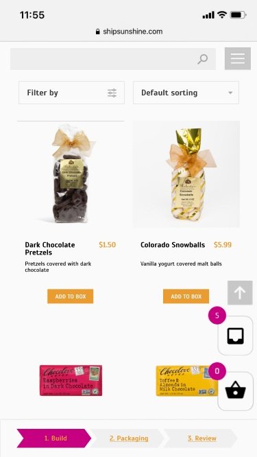
Navigating the products on the custom “Build a Box” page requires excessive scrolling. 10 participants have found this to be an issue. “[I feel like there is] a lot of scrolling.”

Current website design of products on the custom “Build a Box” page
PROPOSED DESIGN SOLUTION
Displaying the products on a three-column grid layout
Removing the detailed descriptions from the default view and instead displaying them only when users click to read more about a specific product


PROBLEM 2
The categories and steps of the custom “Build a Box” are confusing to some users. Categories, like “Happy + Cheery”, were not informative for many of our participants. “so I see there's a happy plus cheery, but I'm not too sure what that is.”
13 participants suggested that the numbering did not make sense to them up until the “Packaging” and “Review and Purchase” steps.
Participant 13 expressed confusion because of the naming of the categories, as it was difficult to find the exact type of item they were looking for. Furthermore, some items appeared under multiple categories, like tea being under “Food + Drinks” and “Made in Colorado,” causing confusion. “I don't know why [the system] didn't tell me I have the same item in my box twice.”

Current design of categories and steps of the custom “Build a Box” page
PROPOSED DESIGN SOLUTION
Categorize the items strictly according to item type, such as food and drinks, kitchen accessories, home decorations, etc.
Make the categories filterable and sortable.
Each category can be further refined with specific subcategories, such as chocolate, cake mix, and tea, under food and drinks.
Reduce the number of steps along the top of the “Build a Box” page from eight steps to three steps.


PROBLEM 3
For the custom “Build a Box”, there is no clear indication of what the user has added to their gift box. 12 participants have found this to be an issue and have shared their concerns during our evaluation. “yeah, it's kind of dumb that I have to memorize each item that I put into my box.”

Current display of added items on the custom gift box
PROPOSED DESIGN SOLUTION
Allow users to see the quantities for each of the individual items when viewing the items in the user’s box.
Allow users to make immediate modifications to their box.
Add images to the items that have been added.
Display the total number of items that the user has added to their gift box as an icon above the pre-existing cart icon.


Combining the three design solutions would create a user interface as shown below.

PROBLEM 4
The placement of the “Rush My Order” option does not follow the typical e-commerce conventions. 9 participants did not expect to find “Rush My Order” under the product description page.

“Rush My Order” option displayed below the product description.
PROPOSED DESIGN SOLUTION
Place the “Rush My Order” option on the checkout page. Additionally, a popup offering the “Rush My Order” option will be displayed upon clicking the checkout directly from the cart overlay.


PROBLEM 5
10 participants failed to identify the company values and goals even after entering the “About Us” page. “[I] do not want to read this [lengthy About section]”
Many participants expected but failed to find the link to the "About Us" page in the footer of the landing page on the mobile interface. “I thought the about us link would be on the [mobile] homepage.”

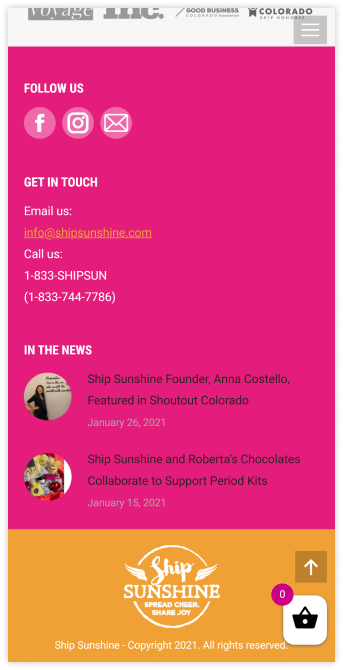
The footer of Ship Sunshine’s main home page and a screenshot of the About Us page
PROPOSED DESIGN SOLUTION
The information hierarchy within the “About Us” section should be improved so that important information about the company is apparent at a glance.
Include the "About Us" link within the navigation bar and the menu to improve the efficiency of the website experience when looking for important information about the company.


Reflection.
CHALLENGES
Finding the right participants for the usability test was challenging because this project was conducted during the Covid-19 pandemic. Ensuring that the participants are in the most idealistic environment and following instructions properly was hard to manage. This challenge was overcome by using camera and screen share features on Zoom and asking the clients to verbally voice out their thoughts and feelings.
POSSIBLE FUTURE ITERATIONS
I want to see the design proposals implemented and run the same usability test to compare the results. I think it would be a great learning opportunity to see what worked and what did not and also gain new insight on how to make the website even more user-friendly.