Creating a unique digital experience for music lovers
Strange Sounds from Beyond: Brand and Microsite Design
This five-week school project was centered around developing a visually engaging and interactive microsite for "Strange Sounds from Beyond," an avant-garde music festival held in Amsterdam. The festival attracts a niche audience with a love for underground and experimental music. The challenge was to create a compelling microsite experience that incorporate both visual and auditorial concepts that are appealing for visitors who may not be familiar with the festival’s style or artists.
As the primary interaction designer, I led the conceptualization and implementation of the interactive UI features. I focused on creating a user journey that allowed music enthusiasts to explore the festival’s unique identity while balancing an engaging aesthetic with functional usability.
🏢 Reference Client
Strange Sounds from Beyond
📅 Year
Sep 2023 - Oct 2023
💪 Team
Chris, Vito, Andy, Kristen
🔧 Tools
Figma, Adobe AE
Understanding brand foundations
The biggest challenge of this project was developing a festival brand that was adaptable and translatable across various physical mediums. To guide our approach, our team referred to several key professional resources:
Experience Design: A Framework for Integrating Brand, Experience, and Value by Patrick Newbery and Kevin Farnham
Laws of UX: Using Psychology to Design Better Products and Services by Jon Yablonski
Graphic Design The New Basics by Ellen Lupton and Jennifer Cole Phillips
Setting the visual language
This is the final visual identity our team landed with. We designed so that the Geometric shapes that frame elements and the elements breaking out of grid structure to be the transferable qualities across different design mediums.
Degular is a versatile font with bold stroke width and curvature. We wanted to use bold, rounded typeface that could fill in the space within our frames. To contrast the boldness of Degular, we used JetBrains Mono, to maintain legibility to balance the two typefaces.
As we wanted to use typography and framing shapes as our focal point, we decided to turn our images greyscale and added grain and noise. This way, the images blend into the composition without taking away from the typography.
We used vibrant green to capture attention and highlight parts of the composition. White and black is used for a cleaner aesthetic with the vibrant green.
Our team went through several iterations to solidify the visual language with the teaching team acting as the client. We started with the festival poster as our primary medium, focusing on ensuring the design's responsiveness, the festival's identity, and the emotional impact we aimed to convey.
Crafting the microsite experience
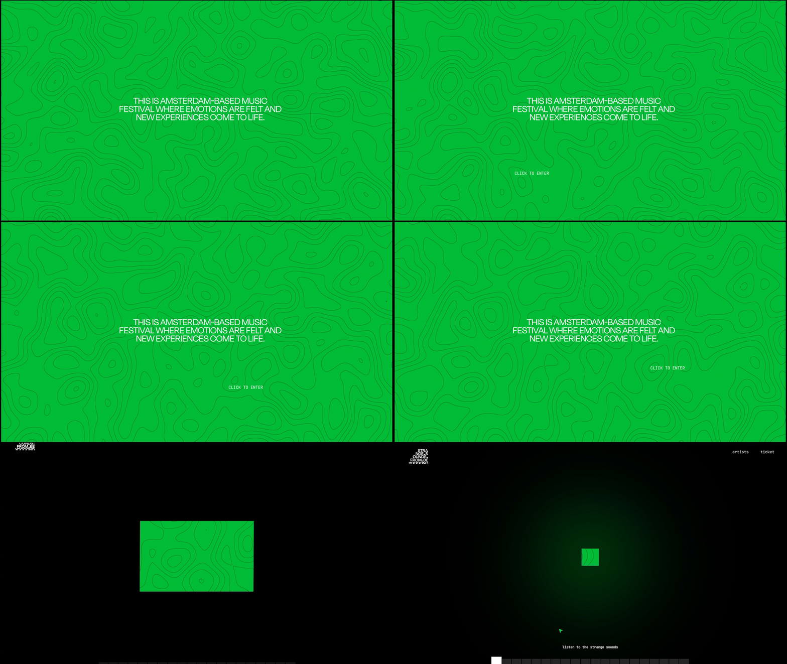
After establishing the visual language and framing the design problem for our microsite, we shifted our focus to exploring interactive UI elements. This was particularly challenging because our client heavily relied on conveying auditory experiences, which are difficult to translate into a visual digital medium.
We carefully planned this out alongside the content strategy to determine the types of screens needed to effectively guide the user journey.
How might we provide compelling experience with sound interaction in order to inspire site visitors unfamiliar with the festival to attend the festival in person?
Content strategy
Interactive UI exploration
Pushing the design forward
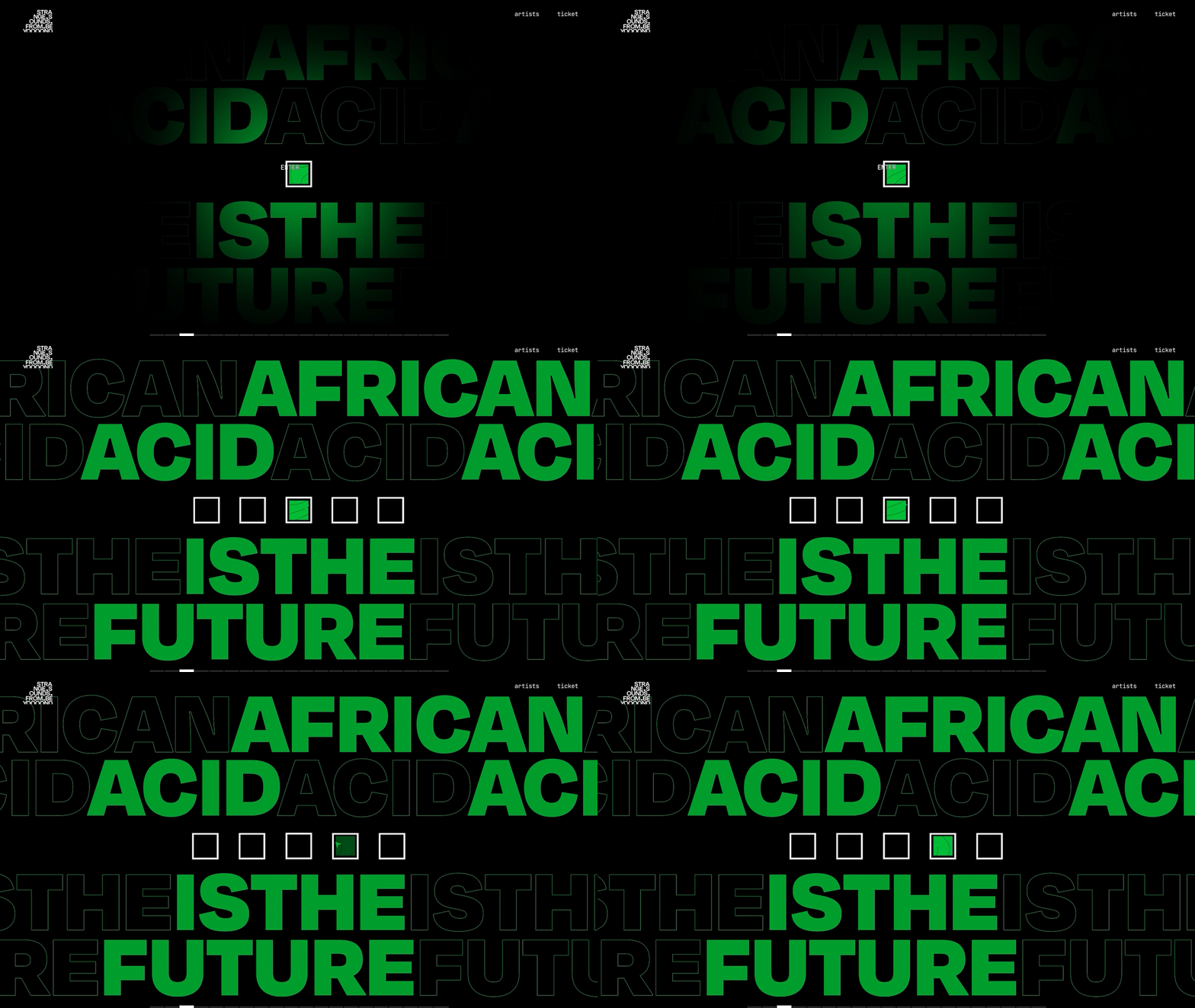
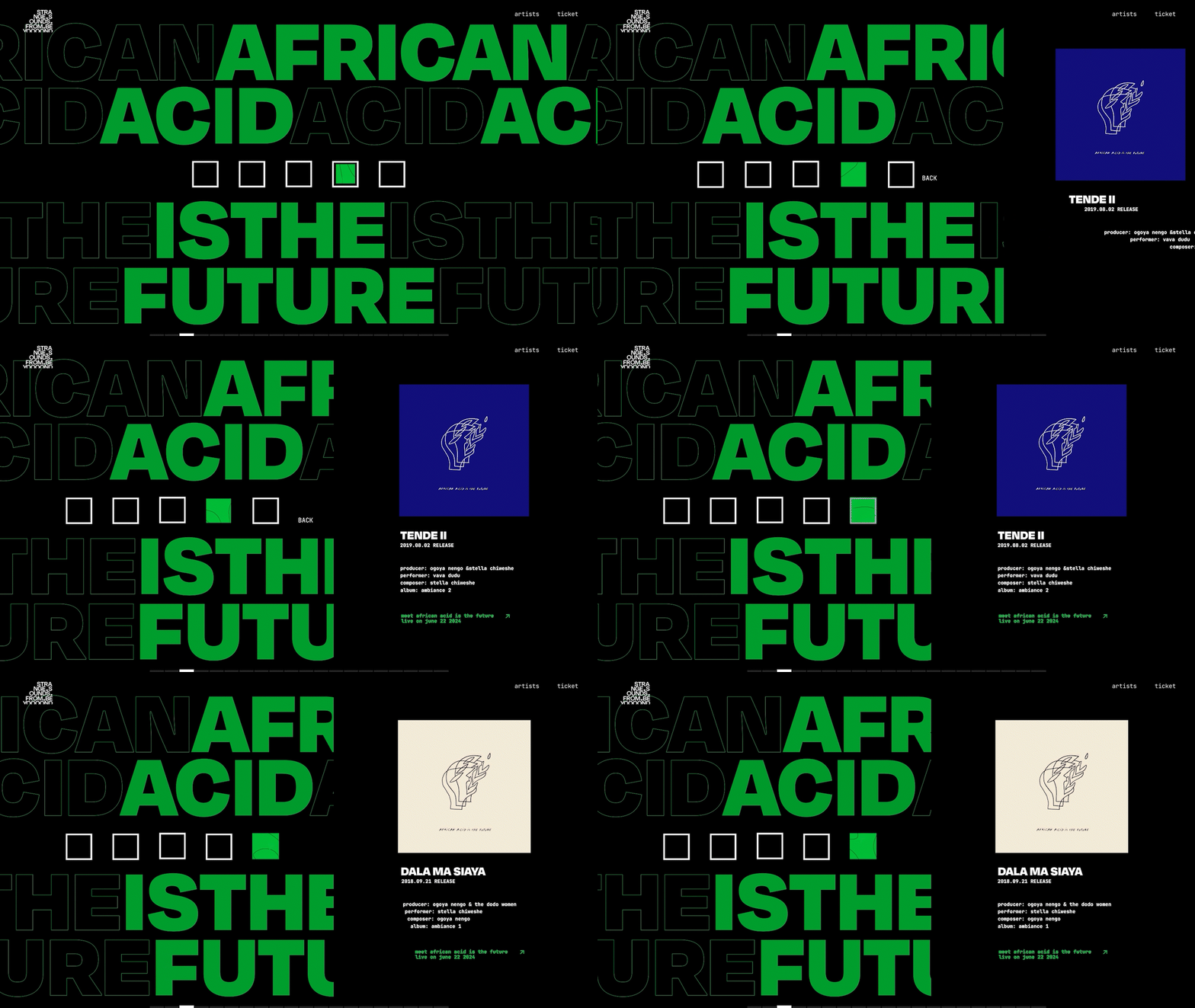
My suggestion to intentionally hide the artist information and guide users solely through sound received a lot of positive feedback. We aimed to make the music the focal point of the experience. By deliberately concealing the artists' information in the selection menu, we allowed users to navigate purely based on the sounds created by each artist.
This positive feedback led to me taking on the role of lead interaction designer for the main homepage. The following design decisions were made and implemented:
Balancing emotion with functionality
Our team recognized that the auditory-based navigation could present challenges for users. Returning users might seek a quicker way to navigate to specific artists or purchase tickets, and the site could be confusing for users without sound access.
In other words, we realized that the emotional experience needed to be balanced with functional features to improve usability. As a result, we implemented options for users to directly access artist information and purchase tickets easily.
This project provided me with a deeper understanding of the challenges in creating a digital experience that balances emotional engagement with functional usability. Designing for "Strange Sounds from Beyond" required me to push creative boundaries, incorporating auditory elements into a visually driven interface. As the lead interaction designer, I refined my ability to craft an immersive user journey while addressing practical needs for accessibility and ease of use. Beyond design, this experience enhanced my critical thinking, task management, and ability to clearly communicate and present ideas.


